| Budget DTP | |
| on RISC OS |
8: Page Layout
Before you can begin to think about the design of a page, you must consider the overall document size, page size and the number of pages the document needs.
Multi-Page Documents
One frequent complaint about !Draw as a DTP system is that it does not allow the creation of multi-page documents. In a sense that is true-each !Draw window contains only one "page". Although you can have several !Draw windows open simultaneously, you cannot divide a text area between them (although you can transfer the same text file into all of them).
There is, however, a simple way in which multi-page documents can be handled. The "paper limits" sub-menu in the "miscellaneous" menu in !Draw allows you to select page sizes ranging from A5 to A0 with A4 as the default. You may deliberately choose a larger page size than the one you are using and divide it into page-sized portions. For example, if you are laying out a magazine article consisting of four pages of A4, you may select A2 and draw guide lines vertically and horizontally through the centre of the sheet. You have now divided your A2 sheet into four A4-sized areas which you may treat as pages. You may place your text area boxes wherever you wish on these "pages" since !Draw regards them all as one large page.
Printing such a "multi-page document" demands care. If your printer handles only A4-sized pages, the printable area revealed by selecting "Show" on the "Paper limits" sub-menu (if the printer driver is or has been installed) will be in the bottom left-hand quarter of the sheet. Print this page first. You may delete the "page divider" lines if you wish, but they will probably be just outside the printable area shown by the paper limits, and so not matter. Although the printable area itself cannot be moved, the contents of the sheet can be moved relative to it, which amounts to much the same thing. On the "Select" sub- menu choose "Select all". You can now drag the entire contents of the sheet until another of your A4 pages fits snugly in the printable area and then print it. Repeat this process until all the pages have been printed.
Theoretically there is nothing, apart from memory availability, to prevent you from choosing an A0 sheet size and dividing this into 16 pages of A4 or even 32 of A5. But, as always, there is a price to pay for this facility. The more contents you have on your sheet, the slower the scrolling and printing becomes-especially the printing! Before each pass of the printer head all of the objects have to be examined to see how they affect the portion of the page about to be printed. By all means use this "multi-page" capability, but in moderation.
Page Layouts
Having decided the page size and the number of pages needed, you can turn to the layout of individual pages. Obviously this is to some extent a subjective matter-"if it looks good, it is good". Detailed consideration of the artistic principles behind page layout are out of place in this book. You will find plenty of expert guidance in books on print and design in your local public library. There are, however, some fundamentals that can be briefly outlined.
Probably the page size that you will use most often is A4. This is the most popular paper size in Europe and it is the default page size in !Draw.
Your layout will be influenced by the nature of the document. If it is a poster advertising a meeting, of necessity it needs to attract attention from a distance and so the type sizes must be large; say from 24 to 150 pt. All lines will in theory be the full width of the page, excluding the margins.
ColumnsIf, on the other hand, it is a page of a magazine article, you will need much smaller typefaces. The main bulk of the article, the "body text", will probably use type in the size range 8 to 12 pt. The main title might be as large as 24 or 36 pt. Intermediate sizes would be used for sub titles. But if you choose, say, 8 pt Trinity Medium for your body text, readers will find the article difficult to read if the lines run right across the page. This is why magazine pages, like newspapers, are generally laid out in columns. An A4 page is often divided into two columns each 20 or 21 ems wide (one em is 1/6 in or 12 pt) or three columns each 13 or 14 ems wide. A news page consisting of mainly short items might use four columns each 9.5 or 10 ems wide. Typically gaps about 1 em wide are left between the columns.
Leading
You will also need to consider the amount of space between adjacent lines of body text. This is known as the "leading", a term which dates from the days when printers inserted thin strips of type metal (a tin/lead alloy) between adjacent lines of type to space them out. Leading makes columns easier to read because it helps the eyes to find their way from the end of one line to the start of the next. The wider the columns the more leading they need. In practice the outline fonts have considerable in-built leading to allow space for accents on capital letters. So, if you set the line spacing to the same value as the font height, the text will look quite acceptable in narrow columns. But with wider columns make the line spacing 1,2 or even 3 points greater than the font height.
Style sheets
If you are using !Draw and !Edit to produce a magazine, you will want to give it consistency by ensuring that the columns are of uniform width and height on all the pages. In the olden days of cut and paste this was done using "make-up sheets" on which the columns were accurately ruled out. The galley proofs were cut up and pasted following these column guides. The DTP equivalent of this is a blank style page, that is a page which has guide lines for the columns and margins already in place. Most DTP packages allow you to set up standard style pages.
As usual you can do this in !Draw. Set up a blank page of the correct size and orientation. From the main menu display the "Grid" sub- menu and then select "show". I still think in ems, a legacy of my background in trade journalism. Therefore I find it easiest to change the grid subdivisions to six per inch, each equal to one em. However, you may feel happier with other units. Turn on "Grid Lock" and mark out your columns using brightly coloured rectangles, I prefer bright green. They will automatically snap to the grid so it's easy to ensure they are all uniform size and correctly positioned. Some people also like to have horizontal rules across the page dividing it into, say, quarters. You can add these using /Draw's "line" facility if you wish. When you transfer your text in from !Edit, simply manipulate the text boxes or columns until their red outlines coincide with the column guides. But, unlike the page dividers mentioned above, you must remember to delete them before printing or the printer will faithfully reproduce them as dotted lines. If you "Group" ("Select" sub-menu) all the column guides and other guide lines they can all be deleted in one fell swoop.
Most magazine pages have running footlines, typically with the magazine title on each left-hand page and the issue date on each right- hand page. These can be inserted on to the style page as text objects; you will of course need separate left-hand and right-hand style pages unless you work your pages in pairs. You must remember to update the date line each issue. Once the style pages are made up, save them. Then you can reload them each time you wish to start work on a fresh page. But rename and resave the page immediately or else there is a real danger that you will resave your finished or half-finished page with the style page file name, deleting your precious style page!
How To Create Some Special Effects
Tables!Draw itself has no tabulator. But, as usual, there are several ways to create tables in !Edit!Draw. Each presents its own peculiar advantages and disadvantages.
- Create it as a set of text objects in !Draw, each individual item in the table being a separate text object. All can be manipulated carefully to the right places. Using "Grid Lock" will help you to get items correctly aligned. This method is probably the easiest to understand, but it is fiddly and not elegant.
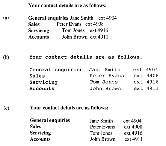
- Create it "horizontally" in '.Edit as a text area object or part of a text area object, using !Edit's tabulator. This is probably the most straightforward method, but it has one massive disadvantage. In proportionally spaced fonts such as Trinity and Homerton the spaces used by the tabulator do not correspond to character widths since the characters have various widths. Any attempt to create a table using this method and a proportionally-spaced font will result in an appalling mess! For this reason you are confined to using fixed-width fonts such as Corpus and your table will look as though it has been created using a typewriter. Figures 8.3a and 8.3b show what happens when you create a table by this method using Trinity and Corpus respectively.
- Create it "vertically" in !Edit as a text area object or part of a text area object. This requires you to think "columns" instead of "lines". In the header allow enough columns (\D) to compose your table column by column. When you type the contents, work down each column, ending each entry with \<CR>, in turn. When you transfer the file to !Edit, arrange that each column's contents form a separate column and move the resulting columns until they line up neatly. Once you've mastered thinking "vertically" this method is very easy and does give neat results with proportional fonts.
The following illustration shows three methods of producing a table. The "horizontal method" using !Edit's tabulator gives untidy results which proportionally spaced fonts such as Trinity (a). It is tidier with fixed width fonts such as Corpus (b), but this would look much beeter in a proportional font as shown in (c) which is done using vertical text areas.
With tables containing numbers do remember that numbers need to be aligned by their least significant figure. This means that if you are working with numbers having varying lengths you must add leading spaces before shorter numbers to make them up to the length of the longest. And in proportionally spaced fonts two spaces will be required to compensate for each missing digit. For example, a column containing the numbers 8, 115, 27 and 1066 looks wrong if printed thus:
    8
    115
    27
    1066
But with leading spaces added the columns line up correctly:
       8
     115
      27
    1066
Drawings
One significant advantage of !Draw over most "real" DTP packages lies in its comprehensive graphics tools. Its extensive drawing facilities were briefly described in Chapter 5 and are explained in depth in the User Manual. It also allows you to import sprites such as saved screens, parts of saved screens, clip art and any sprites which you have created in !Paint. These are considered in more detail in the next chapter.
!Draw's facility for drawing lines, boxes and geometrical shapes with or without fill colours provides a very powerful tool for DTP work. It allows you to create the graphs, bar charts and pie charts which are often used in reports, presentations and technical articles. Pie charts and bar charts are considered in detail below. Labels and lettering can easily be inserted as text objects. Finally grouping all the components of the diagram allows you to scale the entire item to fit the space available on the page.
Drop shadowsDrop shadows are a most attractive effect. A drop shadow is an apparent shadow, normally in black or grey, behind an item in a box, whether a heading or news item or illustration or announcement. By creating the illusion that the box is "floating" in space a little in front of the page and casting a shadow on to it, it helps to attract the reader's attention. Drop shadows are straightforward to create if you think through the steps logically. There are several methods and the following, though arguably clumsy, is easy to follow and works well enough.
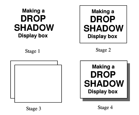
- First compose the text, logo, diagram or other content that is to go inside the box having the shadow.
- Then select the "rectangle" icon. Click MENU and display the "Style" sub-menu. Choose your line width and colour and also your fill colour, that is the background colour for the box which will most probably be white. Do not leave the fill colour as the default "transparent". Now "pull out" a box around its contents. When the box is finished its fill colour will of course conceal the contents, since later objects obscure earlier ones. So enter "Select" mode, select the box and on the "Select" sub-menu choose "Back". This moves the box behind its contents, so now the contents appear correctly in a box having the right background colour.
- Select the box you've just drawn and press CTRL-C to make a copy of the box. This will appear on top of the other items and slightly below and to the right of the box you were copying.
- Select the new box and open the "Style" sub-menu again. Set both the line colour and fill colour to the required shadow colour. Black is often used but grey shades also look very attractive. Go into "Select" mode again and move the shadow to the back as you did the box outline previously. It will now be behind the original. While it is selected you can adjust its position if you need to.
If you use several drop shadows on the same page, all should use the same colour and should be offset the same distance and in the same direction from their original boxes.
Pie charts
Pie charts are a most effective way to present numerical information highlighting the proportions of different contributions. An example might be the proportions of sales made by various sales representatives. They are not, however, the easiest form of chart to produce. The technique I use is as follows.
First calculate the angle needed at the centre of each sector by multiplying the percentage represented by 360. Then decide on the size of the circle and the colour of the largest sector. Click on the "ellipse" icon in the toolbox, click "menu", display the "Style" sub- menu and set "Fill colour" to the chosen colour for the largest sector. Line colour is best left at black. Line width is not very important; the default "Thin" is quite adequate.
Turn "Grid Lock" on. Place the pointer where you want the centre of the circle to be and click "select". Pull out your circle to the desired size and click SELECT again.
Leave your largest sector until last. Choose your first sector, click SELECT on the plain "line" icon at the top of the toolbox. Click "menu", display the "Style" sub-menu and change the "Fill colour" to the fill colour you wish to use in this sector. Place the pointer on the circumference of the circle right at the very top, ie at "12 o'clock". Click SELECT to start your line. Move the pointer to the centre of the circle and click SELECT to complete your first sector boundary. Now guess the correct angle clockwise (it does not matter if you are wrong) and place the pointer on or near-but emphatically not outside-the circumference where you guess the other boundary to meet it and click "select". Now click on the auto-close curve icon (fourth from the top in the toolkit) and simply click "adjust". The shape will be closed by a curved line joining the two sector boundaries and protruding somewhat outside the circumference of the circle.
Now this is important. Drag (by holding down "ADJUST") the curve control points on to the circumference, so that the sector you have created does not protrude outside of the circle. We are about to rotate the circle about its centre; if the sector protrudes outside the circumference, the circle will rotate eccentrically causing inaccuracies. Now to get that guessed angle exactly correct! Click on the SELECT icon, click "menu", and display the "Select" sub-menu. From this sub- menu click on "Select all" and then "Group"-this is most important. Turn "Grid Lock" off. Now slide off "Rotate" in the "Select" sub-menu and fill in the number of degrees you calculated earlier for this sector. Rotation is anti-clockwise.
The circle and its solitary sector will be rotated the requisite number of degrees anti-clockwise. Now all you have to do is to adjust the second boundary line until it is vertical. In the "Select" sub-menu click on "Ungroup" and de-select everything except the unfinished sector. On the "Select" sub-menu click on "Edit". Your control points will reappear. Move the pointer on to the point that needs adjustment and drag it until it is on the circumference at 12 o'clock with the boundary exactly vertical. You now have a sector subtending exactly the right number of degrees. There's nothing like doing things properly!
Now to practise using those Bezier curves! You may find it helpful to use the zoom facility to enlarge your view of the curved edge of the sector. Drag the two control points until the temporary lines between the control points and the ends of the curve are exact tangents to the circle (and at exact right angles to the sector boundaries). Your curve may now exactly overlie the circumference of the circle beneath. If so, fine, that's what you want. Click SELECT and your first sector is finished. If not, you will need to lengthen or shorten the control point lines to get the new curve to exactly overlie the circumference. You will soon get the hang of it. When it's just right, click "select". Turn "Grid Lock" back on and repeat this process for all the other sectors except the one in the circle's own fill colours. You need not draw this, just leave it until last and you will find that it has created itself.
Of course, if you're not fussy about exact angles you can omit the rotation stage of the process and just draw your sectors estimating the required angles. Holding a protractor up to the screen may help. But since the software provides the facilities to do the job properly, it seems a shame not make use of them.
If you wish to put labels in the sectors, use white as the text colour against dark coloured sectors and black against lighter sectors-a bold font is advisable. You can add a drop shadow behind a pie chart in the normal way which looks quite effective.
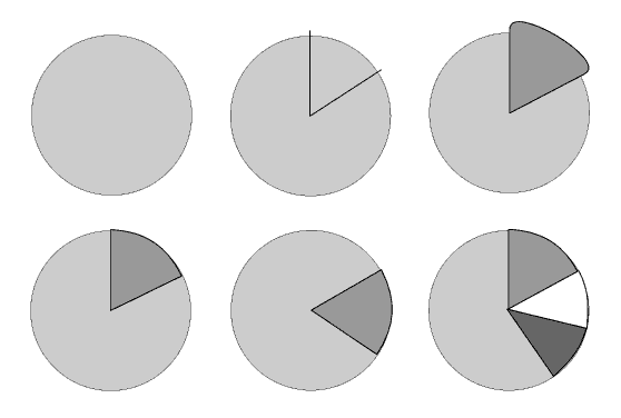
Stages in the creation of a pie chart.
Bar charts
Bar charts are quite straightforward to create. Simply use a row of rectangles side by side. Change the fill colour if you wish or use the same fill colour for each box. You can subdivide boxes vertically by adding rectangles having different colours on top of rectangles.
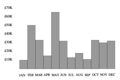
A typical bar chart. Plain filled rectangles like this look somewhat dull.
A plain bar chart, however, like that shown above, is rather uninteresting. It can be enhanced by making it "three dimensional". Figure 8.8 shows the same chart with a kind of "drop shadow" except that it follows the line of the chart as though projected backwards a little way. It is created in much the same way as a drop shadow by drawing the outline over the top of the existing chart and then moving it to the back.
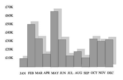
Adding a "shadow" behind the bar chart gives a three- dimensional effect which greatly adds to its attractiveness.
Drop capitals
Drop capitals like that shown below are often used in books and magazine articles to draw the eye to the start of the text. They can be produced in text areas as follows. In the text file omit the first letter (the one that is to be used in enlarged "drop" form) and in the header increase by 1 the number of "columns" in which the text area is to appear.
In the !Draw window introduce your drop capital as a one-character text object. This has the advantage that you can scale it so that it occupies three or four lines as you require. When it is roughly the required size, move it to roughly the right place. Now move your first "column" of text up beside the drop capital. This is, of course/ the portion of text to which the capital belongs. Scale it so that its width fills the gap between the capital and the right-hand edge of the column and its height is equal to or just greater than that of the drop capital. Now bring up the second "column" so that it is immediately beneath the first column and the line spacing is consistent. Scale this so that it occupies the full column width, coming below the drop capital.
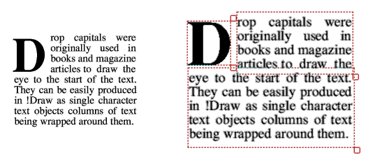
Dropped capitals. The screendump shows clearly the different "objects" used to create this particular effect.
Paragraph indents
Indented first lines of paragraphs are a legacy of drop capitals. The normal width of indent is one em, but this can vary. There is no difficulty in creating indented paragraphs in unjustified text. Just start each paragraph with a set number of spaces; four often gives the right effect. With justified text, however, this method cannot be used since the spaces have variable width. Nothing looks more untidy than seeing each paragraph begin with a slightly different indent. The solution is to begin each paragraph with a fixed number, say four, NBSP characters, that is, Alt-160 or Alt - SPACE. These have the same nominal width as spaces, but their width is fixed and not affected by justification.
Note that outline fonts from some suppliers do not include the NBSP. You can easily add this yourself if you have the !FontEd application. Load the affected font (both Outlines and IntMetrics files) into the font editor. Expand the font index so that both the normal space (Code 32) and the NBSP (Code 160) "compartments" are on the screen. Move the pointer into Code 32's compartment and, holding down "select", drag the compartment into that of Code 160, then release "select". You have now "copied" the space into the NBSP code. Save both font files.
It is also possible to indent paragraphs using the the \M margin command. At the very beginning of the paragraph to be indented insert a command such as \M12 1/ which indents the line 12 points (1 em). After the first word insert another command such as \M1 1/ which restores default margins with effect from the end of the line.
Hanging indents
These are the opposite of indented paragraphs. The first line of the paragraph is full width and all subsequent lines are slightly indented so that they appear to "hang" from the top line like a flag. The effect is best achieved using the \M margin command in the text area file.
Place a \M margin command near the beginning and end of each paragraph. The one near the beginning sets the required margin for the indented text. \M12 1/, for instance, sets a left margin of 12 points (1 em). This must not come into effect until the end of the line so that it is first applied to the following line. For this reason it should not be placed at the very beginning of the paragraph, but after a few characters have been printed. After the first word is a suitable location.
The command at the end of each paragraph is \M1 1/ which simply restores default margins. It is placed after the full stop and before the carriage return so that it takes effect from the next line.
This is a test to see if we can create hanging indent paragraphs. What we do is to put a margin command at the beginning and end of each paragraph.
The one at the beginning of the paragraph sets a left margin of, say, 12 points. But it doesn't take effect until the end of the first line. The one at the end of the paragraph restores default values, but doesn't take effect until the next line, which is the start of the next paragraph.
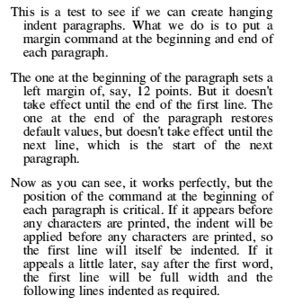
Now as you can see, it works perfectly, but the position of the command at the beginning of each paragraph is critical. If it appears before any characters are printed, the indent will be applied before any characters are printed, so the first line will itself be indented. If it appeals a little later, say after the first word, the first line will be full width and the following lines indented as required.
Vertical, slanted, inverted and mirror-image printing
One thing that it may seem you simply can't do in !Draw is to print text vertically, upside down, on a slant or in mirror image. In practice nothing's impossible. There are three ways to do this: two "elegant" ways which require additional software and one "dirty" way.
Most elegant is a remarkable and surprisingly inexpensive piece of software called IFontFX. This is installed on the icon bar in the same way as other RISC OS applications. It invites you to key in a message of up to 47 characters, choose any of your outline fonts and then apply any combination of a wide range of special effects. These include outlines of various thicknesses, rotation through any angle, wall shadows, floor shadows, slants, lettering in an arc or a circle with or without internal geometrical shapes. All, of course, with a choice of colours from the palette. The list of permutations is endless. The application finally delivers a Drawfile which can be saved to disc or transferred straight into a !Draw window. Once in !Draw the design is regarded as a grouped set of path objects and so it can be scaled to the required size, mirrored/ inverted or rotated as necessary. Each individual character is a separate path object, as is each character's shadow if selected, although all are grouped initially. This means that after ungrouping you can perform further manipulations such as moving the shadow - the possibilities are infinite. !FontFX is excellent value at about £10.
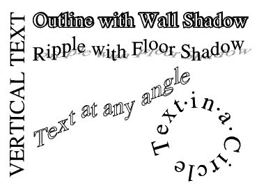
Just a selection of striking effects that can be achieved using IFontFX.
An alternative is the Acorn Font Editor application, !FontEd. This is available from SID and is a very useful tool as it allows you to create your outline own fonts (very time consuming!) or to amend the existing ones. If you install the font editor and !Draw simultaneously (on a one megabyte machine this is just possible) and load the required font into the font editor, you can simply "drag" the characters you need out of the font index and into your !Draw window. There they "grow" to a size of about 100 pt. As with IFontFX so far as !Draw is concerned each character is no longer text but a path object which can be moved, rotated, scaled, turned back to front and so on. And since these are drawings they will reproduce on a printer very smoothly. You will need to use the grid to line up these characters accurately. Group them into words or phrases before you scale, rotate or invert them.
The "dirty" method is open to all RISC OS users. Compose your original piece of text in a !Draw window as a normal text object. When satisfied save the screen using *SCREENSAVE from the OS command line (F12). Quit !Draw, install !Paint and load your saved screen into it. Using the "Get screen area" facility (clicking MENU on the IPaint icon) save just the part of the screen containing your text. Your text has now become a sprite file. Load that back into IPaint. Now using IPaint's "Edit" sub-menu you can rotate your sprite as many degrees as you like and perform other fascinating manipulations. Save each wanted sprite and finally re-install !Draw and load your text-become-sprites into it.
On screen they will appear as normal anti-aliased text except for their new orientation. But be warned! When printed, they will appear "ragged". So far as the print routine is concerned it is now printing sprites and not text. As mentioned earlier sprites are printed on a screen-dump basis with a far coarser resolution than normal text or path-object drawings.
Reversed text
Reversed text is text that is printed in white (or the paper colour) against a black (or the ink colour) background, as shown below.
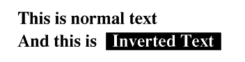
Inverted text is paper-colour text against an ink-colour background.
In !Draw this effect is easily achieved in text objects, but in text areas it poses difficulties.
If the reversed-out text is to form a text object, first create the dark area in which the text is to be set. Select the "rectangle" icon from the toolbox, display the "Style" sub-menu and choose black (or whatever) as the "Line colour" and "Fill colour" colours (don't forget to click on "OK"). Now "pull out" your box to approximately the right size in approximately the right place. You can always get its size and position exactly right later. Select "Text", choose from the "Style" sub-menu your "Font name" (remember that bold fonts look better reversed out), "Font size" and your "Font colour", probably white; again don't forget to click on "OK". Place the caret in the dark rectangle and type your text, which will correctly appear white (or light) against the dark background. It will print out correctly too. If the text is too long for the rectangle, you can always expand the rectangle or compress the text. If the reversed-out text is part of a text area, you have problems. There are \ commands that allow the text colour and background colour to be changed. If you wish to reverse out a short passage of text (white against black) the commands before the passage are:
\C255 255 255/\BO O O/
and those after the passage to restore black on white are:
\CO O O/\B255 255 255/
On screen the reversed passage will appear to be in "outline": white lettering bounded by a thin black line which is in fact the anti-aliasing.
There will be no solid black background behind the lettering. You can, of course, create a black rectangle as described above, move it over the passage concerned and then move it behind the text by clicking "Back" on the "Select" sub-menu. The text will now appear correctly in white against the black background.
Unfortunately, that is not the end of the story. Although all looks well on the screen, it does not print out correctly except with the !Printer PS driver. The other Acorn printer driver applications contain "bugs" which cause a variety of fascinating effects.
Where you must reverse-out a passage in a text area, the only solution is to go for the best of both worlds. Leave the reversed-out passage as normal black-on-white text. Superimpose a black rectangle over the top of it to hide it. Then create a text object in white text repeating the hidden wording and position it in the black box. It may be inelegant but it looks good both on the screen and in print. If the reversed item is one that may be needed many times in the document, such as "Now press <Return>"in a software user manual, you can save time and effort by "grouping" the black box and the white wording and copying them.