| Beginner's Guide to WIMP Programming |
|
| Martyn Fox |
12: Dialogue Boxes
If you have RISC OS 3 or later, look in the ResourcesFS root directory (via the icon bar's Apps icon), then select the 'Resources' subdirectory, scroll down to the Wimp subdirectory and look at the Sprites (or Sprites22) file inside.
While you're looking at these sprites, notice the ones for the various filetypes known to RISC OS, and look at their names. The one for an Obey file, for example, is called 'file_feb', and there's also a small version, called 'small_feb'. This is interesting, because &FEB is the filetype number of an Obey file. We will remember that later.
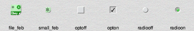
Now take a look at the sprites called 'optoff', 'opton', 'radiooff' and 'radioon'. You will probably have seen them in dialogue boxes. The first two, 'optoff' and 'opton' are used for individual options that can be turned 'on' or 'off'. The other two, 'radiooff' and 'radioon' are normally used in multiple choice situations - turning one on turns off any others in the group.
The secret of how they work lies in the exclusive selection group of the icon that contains them, together with the button type, which is set to 'radio'. When you create an icon of this type in a dialogue box, you can specify a single sprite, or a pair of sprites. If you use a single sprite, its colours become inverted when you select the icon by clicking on it. If, however, you specify two sprites, the first is displayed until you click on the icon, whereupon it's replaced by the second sprite.
If the icon has an exclusive selection group of zero, clicking on it alternately selects it and deselects it - it has no effect on other icons with an ESG of zero. If you change the ESG number to, say, 1, and you have other similar icons in the same group, selecting one icon deselects any others in the group - the 'multiple choice' facility.
Designing our Dialogue Box
This is what the finished dialogue box should look like. The two columns of boxes down the middle contain all the desktop palette colours.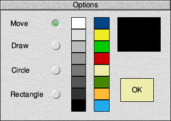
The circular icons are 'radiooff' and 'radioon' sprites. They may vary somewhat in appearance depending on the version of RISC OS installed on your computer, but they will of course work in just the same way.
Begin by loading your template file into WinEd and creating a new window, giving it the identifier 'Options'. The window needs to have a title bar, so that you'll be able to drag it around when you're using it, but in common with the majority of dialogue boxes it should not have any other window furniture. You should therefore remove all the other controls: Back, Close, Toggle and Resize tools, and the scroll bars.
Now drag the Radio icon from WinEd's Icon picker palette into the window. If you now double-click on this icon to open the Edit icon window with its details inside, you will see that its validation string contains:
Sradiooff,radioonThe 'S' at the beginning is a command which tells the Wimp that what follows is the name of a sprite or sprites. (The command can be either upper- or lower-case; 'S' or 's'.) The second sprite will be used when the icon is selected, as described above.
In the Edit icon window, change the icon's text to read "Move" and turn on the R align option, so as to make the radio button appear to the right of the text label. Ensure that its Exclusive Selection Group is set to 1 and its Button Type to 'Radio'. Now click the Update button in the editing window; you should find that you now have an icon with its text label on the left and the radiooff icon on the right.
The icon is now in its final form, although it may need to be resized and repositioned appropriately to match the Move switch in the dialogue box pictured above. Drag it with the Select button if it is not in quite the right place, and if it is not quite the right width, correct it by dragging its edge with Adjust.
When you have it where you want it, make three copies. You can copy icons in WinEd by Shift-dragging an icon with Select. Do this three times to make a total of four radio icons, then select them all and use WinEdit's editing facilities (on the Selection submenu) to align them all horizontally and space them out vertically, as in the previous illustration.
You should now have four identical icons, one above the other. To check that everything is working as it should, put WinEdit into Preview mode and click on the icons. As you do so, each one you click should change form to display the 'radioon' sprite, because it is now selected, and the others will all become deselected and show the 'radiooff' sprite.
Note how clicking on each icon in this group of four causes the other three icons to become deselected. This is because all the icons have the an ESG of 1. If you happened to want multiple groups of icons in a single window to behave in this way independently of one another, you would give each group of icons its own unique ESG number.
For example, try making a copy of the four icons you've just created over to the right-hand side of the window. You can do this easily in WinEd. After leaving Preview mode if you're still in it (choose Edit template from the window menu to go back to editing mode), drag a selection box over all four icons to select them all, then drag all four at once with the Shift key held down to copy them as a group. At this stage, try going back into Preview mode and clicking the new icons: you will find that all eight icons behave as part of the same group, because the new four have inherited the ESG 1 grouping from the originals. So, selecting any one of them will deselect the other seven. Now leave Preview mode again.
Now drag a selection box over the four new icons that you've just copied, and double-click on one of them to open the Edit multiple icons dialogue for all four. In this window, turn on the ESG switch and edit its associated value to be something higher than 1. Update the icons.
If you now go into Preview mode again and experiment with the icons, you will find that the four copied icons behave in a separate group of four from the original set, and you can have one selected icon in each set of four. You can have up to 31 separate groups of icons in a window by giving the icons of each group an ESG value of 1 to 31. An ESG value of 0 is special, and means that the icon is not influenced by the state of any others.
If you have performed this experiment, you should now delete the four copied 'higher ESG' radio icons, as they were merely to illustrate a point and we do not actually want them in our dialogue box. Let's get back to creating the elements that we do need.
Returning to the original four radio icons, the first one is labelled 'Move'. Change the text in the three others so that they read 'Draw', 'Circle' and 'Rectangle' respectively. It is essential that icon zero is 'Move', icon 1 is 'Draw', icon 2 is 'Circle' and icon 3 is 'Rectangle'.
The next icons to create are the two boxes on the right-hand side. The top one, which should be icon 4, is simply a square with no text or sprite. Make its background colour black, its button type 'Never' and give it an ESG of zero. The purpose of this icon is to show the currently selected colour.
The lower box, icon 5, is the 'OK' box for us to click on when we want to close the dialogue box. Change the text to 'OK', set it to be both vertically and horizontally centred and set the foreground and background colours to black on cream. Change its button type to 'Menu icon'. (We are creating a RISC OS 2-style OK button here for instructional purposes; if you understand about 3D slabbing icons, then by all means change it into a 3D button of icon border type R5. Otherwise, wait for the excitement of Section 20!)
You will find that, if you move the mouse over the icon, it will flash rapidly. This is because its ESG is zero. We can't use ESG 1, because that is being used by the four radio icons, so change its ESG to 2. You should now find that it will invert itself when the pointer is over it, which is what a menu icon should do.
The colour icons can be created in any order you like. It is not essential to have them all if you don't want to be able to draw in all the colours.
You'll probably find it easiest to start by creating one icon. Delete its text and drag one edge with the Adjust button to shorten it. When you have positioned it, change its button type to 'Click' and make sure its ESG is 0, then copy it once to the right and copy the two resulting icons downwards seven times. Finally, go through them all and change their background colours, so that you have one of each of the sixteen standard desktop colours.
Now set the window's visible area to the size you want for your dialogue box by dragging the resize icon, then choose Work area... from the menu. In the resulting dialogue box, click the Minimise button and then click on Update. The window's work area is now the same size as the visible area, and your dialogue box is complete.
Before saving the template file, check that the 'Move' icon is selected, as this will be the default condition when we start the application.
Dialogue boxes should ideally be kept small so that they do not clutter the screen. You may well be able to improve on this design. Keep the icon numbers the same, though, or else they will not work properly with the software.